
Glowing Animated Login & Signup Card (Form) - A Step-by-Step Tutorial
By Cristian Quiñones, Published on January 28th 2025 | 7 mins, 1359 words
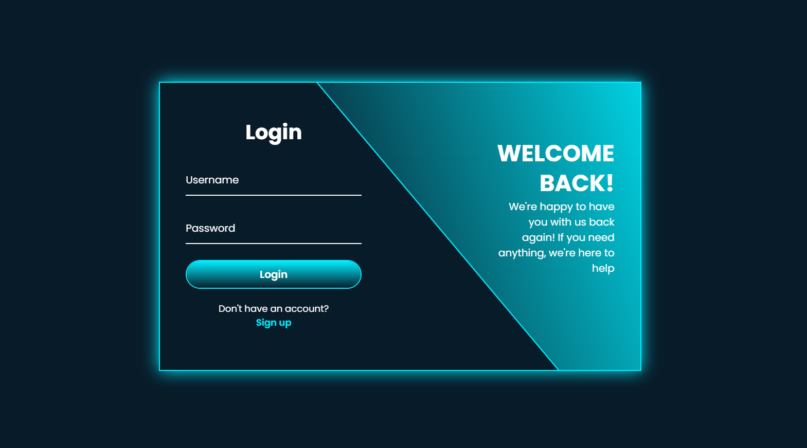
The purpose of this project is to create an multifunctional form that enables users to toggle between Login and Signup modes with a luminous animated effect implemented through technologies like HTML, CSS, and JavaScript.
The form will have:
• A sparkling border effect.
• Smooth animations for transitioning among login and signup forms.
• Input fields with lively labels.
• A responsive design.
So without much to say let`s dive into the implementation!
Step 1: Set Up the Front End HTML Structure
The HTML structure is split into most important sections:
• Login Form
• Registration Form
Each form is wrapped inside a div with the class form-box. The wrapper div contains both forms and handles the animation between them.
index.html
<!DOCTYPE html>
<html lang="en">
<head>
    <meta charset="UTF-8">
    <meta name="viewport" content="width=device-width, initial-scale=1.0">
    <link rel="stylesheet" href="style.css">
    <title>Glowing Animated Login & Signup Card(form)</title>
</head>
<body>
  <div class="wrapper">
    <span class="bg-animate"></span>
    <span class="bg-animate2"></span>

    <div class="form-box login">
        <h2 class="animation" style="--i:0; --j:21;">Login</h2>
        <form action="#">
            <div class="input-box animation" style="--i:1; --j:22;">
                <input type="text" required>
                <label>Username</label>
                <i class='bx bxs-user'></i>
            </div>
            <div class="input-box animation" style="--i:2; --j:23;">
                <input type="password" required>
                <label>Password</label>
                <i class='bx bxs-lock-alt' ></i>
            </div>
            <button class="btn animation" type="submit" style="--i:3; --j:24;">Login</button>
            <div class="logreg-link animation" style="--i:4; --j:25;">
                <p>Don't have an account? <br> <a href="#" class="register-link">Sign up</a></p>
            </div>
        </form>
    </div>
    <div class="info-text login">
        <h2 class="animation" style="--i:0; --j:20;">Welcome back!</h2>
        <p class="animation" style="--i:1; --j:21;">We're happy to have you with us back again! If you need anything, we're here to help</p>
    </div>

    <div class="form-box register ">
        <h2 class="animation" style="--i:17; --j:0;">Sign up</h2>
        <form action="#">
            <div class="input-box animation" style="--i:18; --j:1;">
                <input type="text" required>
                <label>Username</label>
                <i class='bx bxs-user'></i>
            </div>
            <div class="input-box animation" style="--i:19; --j:2;">
                <input type="text" required>
                <label>Email</label>
                <i class='bx bxs-envelope' ></i>
            </div>
            <div class="input-box animation" style="--i:20; --j:3;">
                <input type="password" required>
                <label>Password</label>
                <i class='bx bxs-lock-alt' ></i>
            </div>
            <button class="btn animation" type="submit" style="--i:21; --j:4;">Sign up</button>
            <div class="logreg-link animation" style="--i:22; --j:5;">
                <p>Already have an account? <br> <a href="#" class="login-link">Login</a></p>
            </div>
        </form>
    </div>

    <div class="info-text register">
        <h2 class="animation" style="--i:17; --j:0;">Welcome!</h2>
        <p class="animation" style="--i:18; --j:1">We're delighted to have you here. If you need any assistance, feel free to reach out</p>
    </div>
</div>
    <script src="main.js"></script>
</body>
</html>
Step 2: Styling the the Front End Structure with CSS
Now, let's add the CSS styles to create the glowing effect and smooth animations.
style.css
@import url('https://fonts.googleapis.com/css2?family=Poppins:ital,wght@0,100;0,200;0,300;0,400;0,500;0,600;0,700;0,800;0,900;1,100;1,200;1,300;1,400;1,500;1,600;1,700;1,800;1,900&display=swap');

* {
    margin: 0;
    padding: 0;
    box-sizing: border-box;
    font-family: 'Poppins', sans-serif;
}

body{
    display: flex;
    justify-content: center;
    align-items: center;
    min-height: 100vh;
    background: #081b29;
}

.wrapper{
    position: relative;
    width: 750px;
    height: 450px;
    background: transparent;
    border: 2px solid #0ef;
    overflow: hidden;
    box-shadow: 0 0 25px #0ef;
}

.wrapper .form-box{
    position: absolute;
    top: 0;
    width: 50%;
    height: 100%;
    display: flex;
    flex-direction: column;
    justify-content: center;
}

.wrapper .form-box.login{
    left: 0;
    padding: 0px 60px 0 40px;
    /* display: none; */
}

.wrapper .form-box.login .animation{
    transform: translateX(0);
    opacity: 1;
    filter: blur(0);
    transition: .7s ease;
    transition-delay: calc(.1s * var(--j));
}

.wrapper.active .form-box.login .animation{
    transform: translateX(-120%);
    opacity: 0;
    filter: blur(10px);
    transition-delay: calc(.1s * var(--i));
}

.wrapper .form-box.register{
    right: 0;
    padding: 0px 40px 0px 60px;
    /* display: none; */
    pointer-events: none;
}

.wrapper.active .form-box.register{
    pointer-events: auto;
}

.wrapper .form-box.register .animation{
    transform: translateX(120%);
    opacity: 0;
    filter: blur(10px);
    transition: .7s ease;
}

.wrapper.active .form-box.register .animation{
    transform: translateX(0);
    opacity: 1;
    filter: blur(0);
    transition-delay: calc(.1s * var(--i));
}

.form-box h2{
    font-size: 32px;
    color: #fff;
    text-align: center;
}

.form-box .input-box{
    position: relative;
    width: 100%;
    height: 50px;
    margin: 25px 0;
}

.input-box input{
    width: 100%;
    height: 100%;
    background: transparent;
    border: none;
    outline: none;
    border-bottom: 2px solid #fff;
    padding-right: 23px;
    font-size: 16px;
    color: #fff;
    font-weight: 500;
    transition: .5s;
}

.input-box input:focus,
.input-box input:valid{ border-bottom-color: #0ef;}

.input-box label{
    position: absolute;
    top: 50%;
    left: 0;
    transform: translateY(-50%);
    font-size: 16px;
    color: #fff;
    pointer-events: none;
    transition: .5s;
}

.input-box input:focus~label,
.input-box input:valid~label{
    top: -5px;
    color: #0ef;
}

.input-box i{
    position: absolute;
    top: 50%;
    right: 0;
    transform: translateY(-50%);
    font-size: 18px;
    color: #fff;
    transition: .5s;
}

.input-box input:focus~i,
.input-box input:valid~i{ color: #0ef;}

.btn{
    position: relative;
    width: 100%;
    height: 45px;
    background: transparent;
    border: 2px solid #0ef;
    outline: none;
    border-radius: 40px;
    cursor: pointer;
    font-size: 16px;
    color: #fff;
    font-weight: 600;
    z-index: 1;
    overflow: hidden;
}

.btn::before{
    content: '';
    position: absolute;
    top: -100%;
    left: 0;
    width: 100%;
    height: 300%;
    background: linear-gradient(#081b29, #0ef, #081b29, #0ef);
    z-index: -1;
    transition: .5s;
}

.btn:hover::before{ top: 0;}

.form-box .logreg-link{
    font-size: 14.5px;
    color: #fff;
    text-align: center;
    margin: 20px 0px 10px;
}

.logreg-link p a{
    color: #0ef;
    text-decoration: none;
    font-weight: 600;
}

.logreg-link p a:hover{ text-decoration: underline;}

.wrapper .info-text{
    position: absolute;
    top: 0;
    width: 50%;
    height: 100%;
    display: flex;
    flex-direction: column;
    justify-content: center;
}

.wrapper .info-text.login{
    right: 0;
    text-align: right;
    padding: 0px 40px 60px 150px;
    /* display: none; */
}

.wrapper .info-text.login .animation{
    transform: translateX(0);
    opacity: 1;
    filter: blur(0);
    transition: .7s ease;
    transition-delay: calc(.1s * var(--j));
}

.wrapper.active .info-text.login .animation{
    transform: translateX(120%);
    opacity: 0;
    filter: blur(10px);
    transition-delay: calc(.1s * var(--i));
}

.wrapper .info-text.register{
    left: 0;
    text-align: left;
    padding: 0px 150px 60px 40px;
    /* display: none; */
    pointer-events: none;
}

.wrapper.active .info-text.register{
    pointer-events: auto;
}

.wrapper .info-text.register .animation{
    transform: translateX(-120%);
    opacity: 0;
    filter: blur(10px);
    transition: .7s ease;
    transition-delay: calc(.1s * var(--j));
}

.wrapper.active .info-text.register .animation{
    transform: translateX(0);
    opacity: 1;
    filter: blur(0);
    transition-delay: calc(.1s * var(--i));
}

.info-text h2{
    font-size: 36px;
    color: #fff;
    line-height: 1.3;
    text-transform: uppercase;
}

.info-text p{
    font-size: 16px;
    color: #fff;
}

.wrapper .bg-animate{
    position: absolute;
    top: 0;
    right: 0;
    width: 850px;
    height: 600px;
    background: linear-gradient(45deg, #081b29, #0ef);
    border-bottom: 3px solid #0ef;
    transform: rotate(10deg) skewY(40deg);
    /* transform: rotate(0) skewY(0); */
    transform-origin: bottom right;
    transition: 1.5s ease;
    transition-delay: 1.6s;
}

.wrapper.active .bg-animate{
    transform: rotate(0) skewY(0);
    transition-delay: .5s;
}

.wrapper .bg-animate2{
    position: absolute;
    top: 100%;
    left: 250px;
    width: 850px;
    height: 700px;
    background: #081b29;
    border-top: 3px solid #0ef;
    /* transform: rotate(-11deg) skewY(-41deg); */
    transform: rotate(0) skewY(0);
    transform-origin: bottom left;
    transition: 1.5s ease;
    transition-delay: .5s;
}

.wrapper.active .bg-animate2{
    transform: rotate(-11deg) skewY(-41deg);
    transition-delay: 1.2s;
}
Step 3: Enhace Interactivity with Javascript
The JavaScript code controls the toggling between the Login and Signup forms. Evertime the user clicks the Signup or Login. The .wrapper element has the active class switched on, activating the CSS animations.
main.js
const wrapper = document.querySelector('.wrapper');
const registerLink = document.querySelector('.register-link');
const loginLink = document.querySelector('.login-link');

registerLink.onclick = () => {
    wrapper.classList.add('active');
}

loginLink.onclick = () => {
    wrapper.classList.remove('active');
}
Final Output

After following the tutorial, you will have a Glowing Animated Effect Login & Signup card the has:
A sparkling frame effect.
Seamless transitions among login and signup forms.
Dynamic enter fields and buttons.
A flexible design that functions with all devices.